An emerging trend on social media these days, ‘30 Days of Akuru’, created by Akuru Collective are a bunch of artists who have come together to inspire interest in typography. “The words etched on the surface hold the power to make or break this world: ‘Akuru’ sees this power and looks to understand it better so that we may share it, use it and surmount it,” that’s how they quote it in their ‘Akuru’ manifesto.
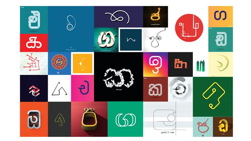
 ‘30 Days of Akuru’ is a fun exercise, an open call to visual designers, illustrators, type designers, typographers and anyone interested in exploring the endless possibilities and dimensions of Sinhala letterforms, Sinhala script. Those interested could submit their own interpretations of the assigned letter of the day within this month on the Akuru Collective Facebook page. The project aims at creating awareness on the endless Sinhala typography and graphic possibilities.
Pathum Egodawatta, Type Designer and Founder of Akuru Collective told the Sunday Observer, “the 30 Days of Akuru campaign is modelled on the popular international annual initiative ‘36 Days of Type’ that explore the Latin alphabet. We chose 30 interesting letters to let people experiment. It is an arbitrary number, nothing to do with anything else other than the number of days in the month of June,”
Pathum explained that they are not looking at fully developed alphabets or fonts. The objective is to let the community express and design letterforms using their graphic design and illustration skills. Most graphic designers have a secret wish to design fonts and make a font some day, because it is kind of a meta-design work and a tool that others could also use. 30 Days of Akuru is an opportunity and motivation for these graphic designers to explore their abilities and share them with the community.
Akuru has a special interest in all native languages of Sri Lanka, particularly, Sinhala and Tamil typography, and looks to enrich their transition into the digital realm where new publications, readers and writers have taken the lead.
Akuru wishes to share typographic culture, knowledge and resources with colleagues, students and others who may be interested. The Collective maintains typographic standards also by collaborating with education institutes and businesses.
Recalling the initial interest that stemmed on her about typography Chamodi Waidyathilaka, co-creator of Akuru Collective says, “the very first time I was introduced to typography was through Pathum Egodawatte’s Amma project. Thereafter, I began to explore more areas in typography. Initially I started experimenting with calligraphy and lettering through my final year project at AOD.”
Explaining the difference between calligraphy and typography Chamodi said, typography is often described as the visual component of the written word. It refers to design and the appearance of the letterforms and more importantly, how the letters are arranged. Calligraphy on the other hand becomes a subject of wider area of typography.
“Calligraphy or beautiful writing is a form of writing with a specific set of tools using specific techniques. There are many global traditions and techniques such as Arabic calligraphy, Indian calligraphy and so on, as seen in ancient manuscripts or texts,” said Chamodi, stressing that Sinhala palm-leaf manuscripts are not falling into the category of calligraphy although many misinterpreted the same. She said the technique of Sinhala palm-leaf manuscripts is significantly different and does not create variations in strokes.
“Calligraphy is different to writing, illustration or drawing letters, commonly known as lettering or hand drawn letters, e.g. in name boards, birthday cards, etc. Often custom logos can be considered lettering, which is different to type design. When you design a font, you have to draw hundreds of letters that could work side by side and should work in many contexts, sizes and combinations. This requires precision, extra care and technical knowledge. Whereas, when you draw a letter or a name it is often a onetime configuration of shapes and colours.
Compared with Indian or Arabic scripts, Sinhala does not have a calligraphy culture. However, in Sri Lanka we have a strong sign painting and hand lettering culture which is now fading away due to digital printing. People do not take the trouble to go through a messy hardworking painting process, and instead use mismatching fonts printed digitally.
“However, we have a community of young designers willing to change this by bringing back Sinhala lettering and create a Sinhala calligraphy culture. When I started doing Sinhala lettering I couldn’t find many people involved in Sinhala lettering or calligraphy online. That’s how I got the idea Letters.lanka,” Chamodi added.
The 30 Days of Akuru only accepts hand-lettering, digital or mixed media and does not accept any existing fonts.
“The selections happen thrice a day and one can start submitting from 12 midnight to 12 midnight the next day. We started with 30 submissions which keeps increasing each day. As the second phase of the campaign we are working on launching a new type foundry, called ‘Akuru Foundry’ to develop fonts for the Sinhala alphabet which has a scarcity of fonts at present,”she explained.
A month-long venture from June 1 to 30, the final collection of ‘30 Days of Akuru’ will come to light through a careful selection from the large pool of submissions of Sinhala letters. There are no rules or regulations and 30 Days of Akuru is for all typography and visual design fanatics and here’s your chance to uplift your native language and its sophistication with your design fantasies.